
How One Old Market Indicator Became One of My Most Valuable Timing Tools
Why the NYSE Bullish Percent is more than a barometer… and how I turned it into a timing framework


Most investors don’t miss major market turns because they lack information.
They miss them because they don’t have a framework that tells them when risk has actually changed.
The NYSE Bullish Percent Index has been one of the most reliable tools I’ve used to identify those shifts.
Not as a “barometer.”
As a timing mechanism.
Why This Matters Now
I get several questions about the indicators I use.
Especially after periods where the calls were not subtle:
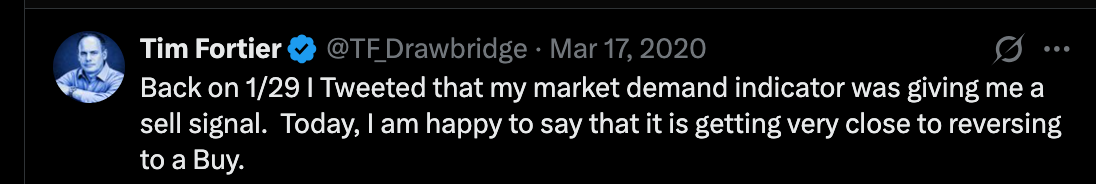
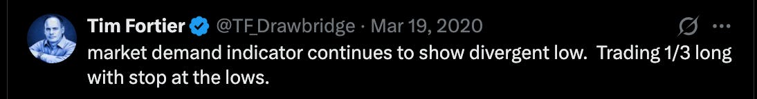
In early 2020, this framework shifted to risk-off before the market collapsed… and then reversed near the lows, when fear—not opportunity—was driving decisions.

In 2022, it did the same thing.
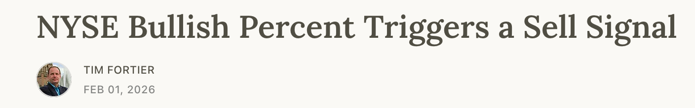
More recently, the February signal, where I turned defensive.

Those weren’t reactions.
They were signals.
If in any one of these periods you were relying on:
diversification
buy and hold
or reacting to headlines
You felt the impact of the market decline.
Most portfolios did.
That’s the difference.
Not between being right and wrong.
But between:
taking the full drawdown
or stepping aside before it happens
This article will give you insight into one of the tools behind those decisions.
And more importantly, what it’s telling us now.
Where This Started
Back in the 1990s, I was a subscriber to Dorsey Wright Research (“DWA”).
That’s where I was introduced to the NYSE Bullish Percent Index for the first time.
At the time, it was presented as a useful internal gauge of the market.
Helpful.
But not actionable.
The NYSE Bullish Percent Index was developed by Abe Cohen in the mid-1950s.
Cohen was the founder of Investors’ Intelligence and an early editor of ChartCraft, one of the original technical research services.
He wasn’t trying to forecast markets.
He was trying to solve a structural blind spot:
Indexes can rise while the majority of stocks are already weakening underneath the surface.
So instead of focusing on price…
He built a way to measure participation.
What the Indicator Actually Measures
At its core, the Bullish Percent Index answers a very specific question:
How many stocks are actually in confirmed uptrends?
It does this by measuring:
The percentage of stocks within an index that are on Point & Figure buy signals
Originally applied to the NYSE, the concept has since been extended to:
S&P 500
Nasdaq
Sector indexes
But the logic remains the same.
Each stock is reduced to a binary state:
Buy signal
Not on a buy signal
That simplicity is the strength.
Why Point & Figure Was Critical
This part matters more than most realize.
Cohen chose Point & Figure charts because they:
Eliminate time
Filter out noise
Focus only on meaningful price movement
He wasn’t trying to smooth data.
He was trying to isolate real shifts in supply and demand.
What he created was not a sentiment indicator.
It was a participation engine.
That’s it.
No forecasts. No narratives.
Just a clean read on internal strength.
How It Was Framed… and Where That Falls Short
Later, Tom Dorsey and the research team at DWA popularized the indicator.
They called it a “market barometer.”
That framing helped adoption.
But it also limited how most investors use it.
The Problem With “Barometers”
A barometer tells you what is happening. Just like in weather, it defines a condition.
It does not tell you what to do.
That distinction matters more than most realize.
Because investors don’t lose money from lack of data.
They lose money from a lack of decision frameworks.
So what happens in practice?
Markets get “overbought”… and keep rising
Markets get “oversold”… and keep falling
The indicator gets blamed.
When the real issue is how it’s being used.
The Transition That Actually Matters
Cohen gave you the raw signal:
Participation.
But the real edge comes from a different question:
When does participation shift enough to signal that risk has actually changed?
That’s not measurement.
That’s timing.
That’s also where my work began.
The Shift: From Measurement to Timing
In 2006, I started looking at the indicator differently.
Not as a condition.
But as a transition.
And it began by asking the above question.
That led to a different approach.
Instead of relying on the traditional Point & Figure presentation, I:
Tracked the daily values directly
Applied trend and momentum overlays
Built a rules-based structure around it
What came out of that was not another opinion.
It was a framework.
The Framework (What Actually Drives Decisions)
Every signal I act on follows a structured sequence.
Not one indicator.
Not one guess.
A three-step requirement:
1. Structural Shift
Breadth begins to deteriorate or improve beneath the surface.
2. Confirmation
The move becomes persistent, not isolated.
3. Actionable Signal
Only then does it translate into a decision.
This is where most investors fail.
They act on step one.
Or worse, they wait for price to confirm everything.
By then, the opportunity is gone.
Why This Works
Because major market turns don’t start with price.
They start with participation, breaking down underneath the surface.
That’s what the Bullish Percent captures.
Not headlines.
Not narratives.
Actual internal strength or weakness.
When structured properly, it stops being descriptive…
…and becomes actionable.
How This Fits Into My Process
This is not used in isolation.
It’s part of a broader, risk-first framework that includes:
Market Cycle
Market Dynamics
Smart Money positioning
Each tool answers a different question.
The Bullish Percent answers this one:
Is the market internally strengthening… or quietly falling apart?
The Message Right Now
This isn’t theoretical.
On February 1, I published a Substack article outlining a clear shift in this indicator and its implications for risk.
Not after the decline.
Before it.
Paid members didn’t just get the explanation.
They got the positioning.
Exposure reduced, e.g., the Smart Money Portfolio is 70% cash
Risk tightened
Hedges added
Those hedges mattered this past week.
While the benchmark moved lower, those positions did exactly what they were supposed to do:
Offset risk when it actually showed up.
That’s the difference between:
Watching the market
And preparing for it
By the time risk is obvious…
The opportunity to manage it is already gone.
That’s why most portfolios:
Take the full drawdown
Then try to recover
This is avoidable.
But only if you’re working from a framework that identifies when conditions change, not just when price confirms it.
If you want to stop reacting after the fact…
…and start positioning before risk becomes obvious…
That’s exactly what I provide inside No Excuses:
Real-time signals when conditions change
Portfolio adjustments based on those signals
Clear, rules-based decisions
No opinions. No narratives.
Just structure.
Because the biggest edge in markets isn’t prediction.
It’s recognizing when risk has already changed.
Where we stand today
I’m going to show paid subscribers exactly what this indicator is signaling as of Friday’s close…
…and what it means for positioning right now.
Because this is where the difference is made:
Not in understanding the indicator.
But in acting on it before the move becomes obvious.
